Work / Frame 03 — TFI App03 of 16
TFI App
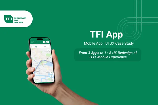
From three apps to one: a unified redesign of Ireland's public transport experience.
CoverMobile app
 600 × 400
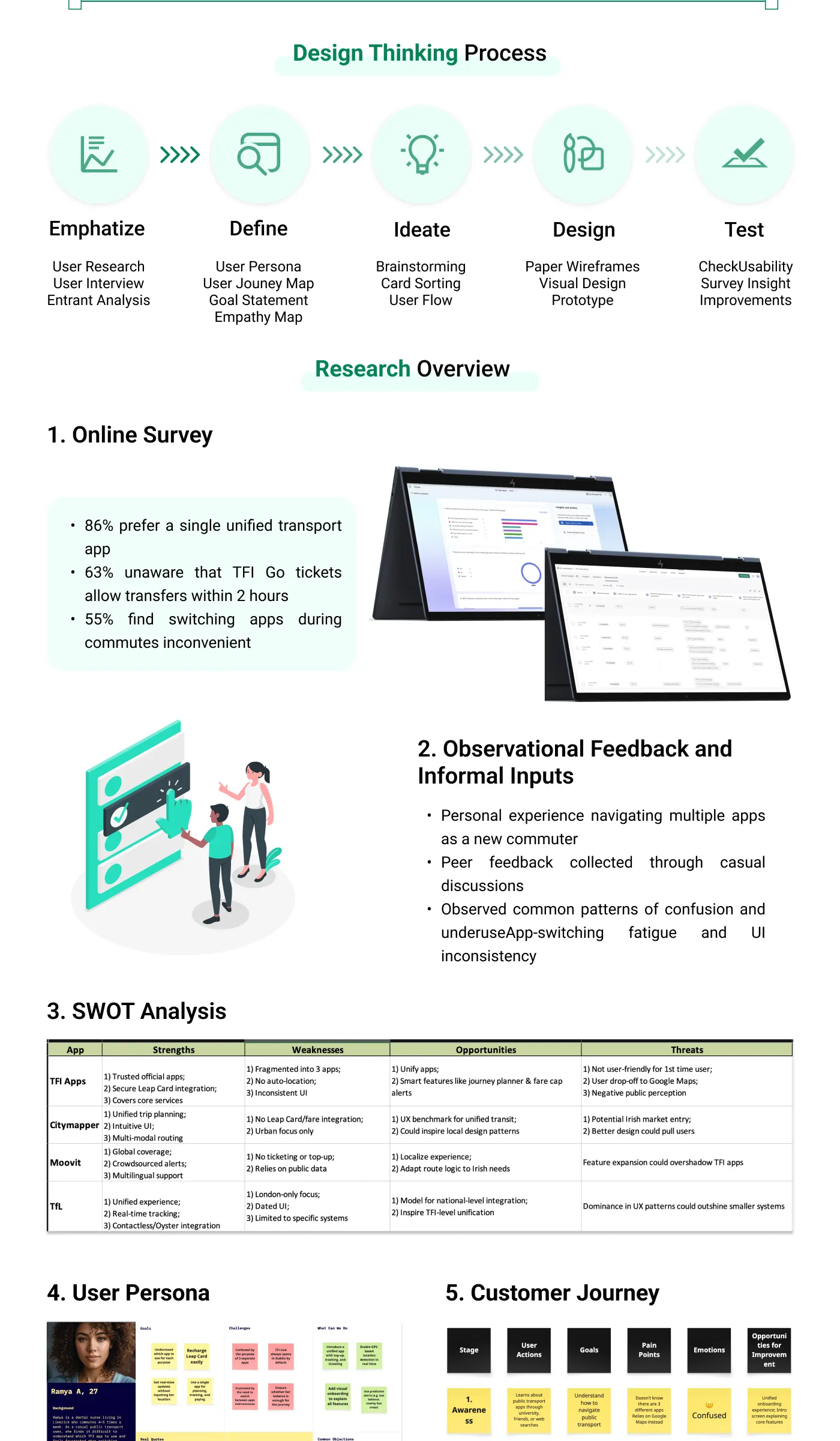
- of surveyed commuters prefer a single unified transport app
- Metric 0186%of surveyed commuters prefer a single unified transport app
- didn't know TFI Go tickets allow transfers within 2 hours
- Metric 0263%didn't know TFI Go tickets allow transfers within 2 hours
- find switching apps during commutes inconvenient
- Metric 0355%find switching apps during commutes inconvenient
Overview
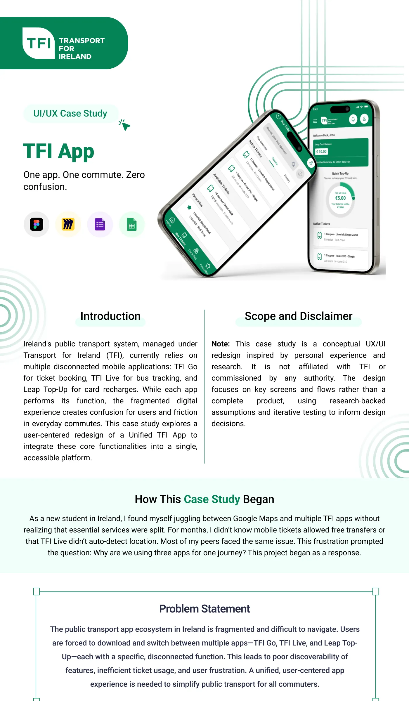
Ireland’s public transport, managed under Transport for Ireland (TFI), relies on several disconnected apps: TFI Go for tickets, TFI Live for bus tracking, and Leap Top-Up for card recharges. Each works on its own, but together they create confusion and friction in everyday commutes. This project explores a unified TFI app that brings those functions into one accessible platform.
This is a conceptual redesign inspired by personal experience and research. It is not affiliated with or commissioned by TFI, and it focuses on key screens and flows rather than a complete product.
The problem
As a new student in Ireland, I juggled Google Maps and multiple TFI apps without realising essential services were split between them. For months I didn’t know mobile tickets allowed free transfers, or that TFI Live didn’t auto-detect my location. Most of my peers had the same issue, which raised the question: why are we using three apps for one journey?
The fragmented ecosystem leads to poor feature discoverability, inefficient ticket use and frustration.
Process
I followed a design thinking process: empathise, define, ideate, design and test.
- Online survey: 86% preferred a single unified app, 63% didn’t know TFI Go tickets allow transfers within 2 hours, and 55% found switching apps during commutes inconvenient.
- Observation and informal input: my own experience as a new commuter plus peer feedback revealed app-switching fatigue and UI inconsistency.
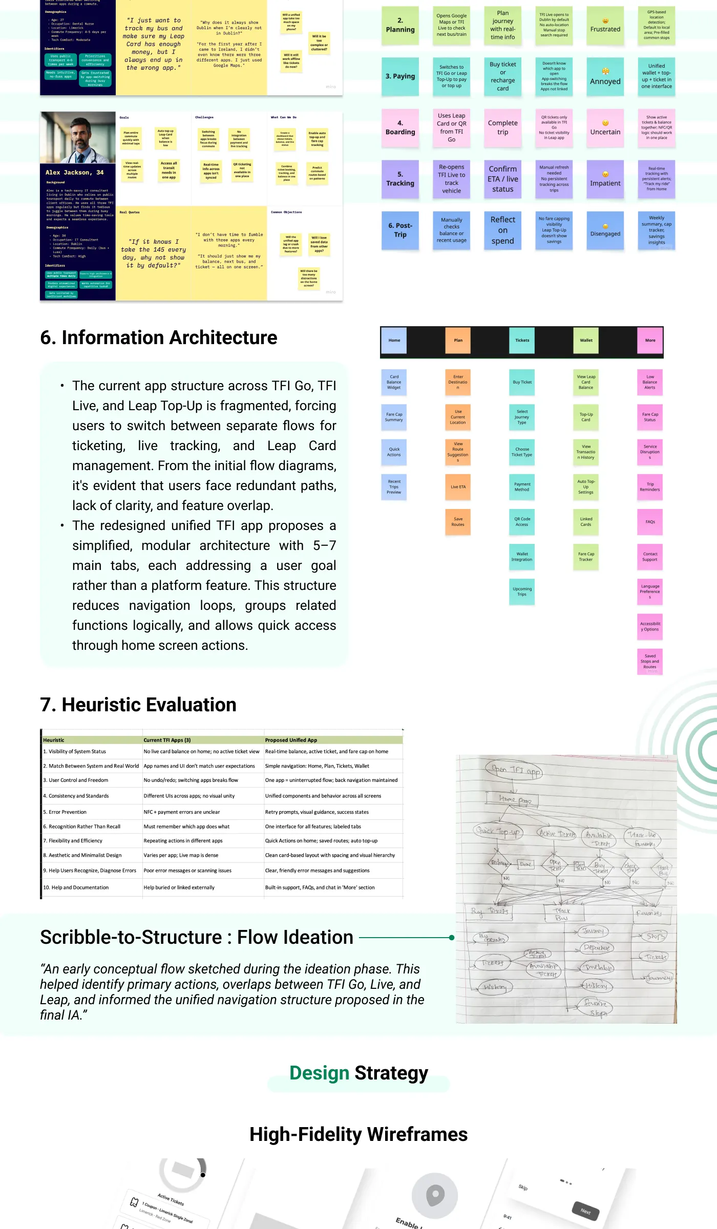
- Synthesis: SWOT analysis, a user persona, a customer journey map and a heuristic evaluation.
- Information architecture: the existing flows had redundant paths and overlapping features. I proposed a modular structure with 5–7 main tabs, each built around a user goal rather than a platform feature.
- Flow ideation: early sketches identified primary actions and overlaps between TFI Go, Live and Leap, and shaped the unified navigation.
Key features
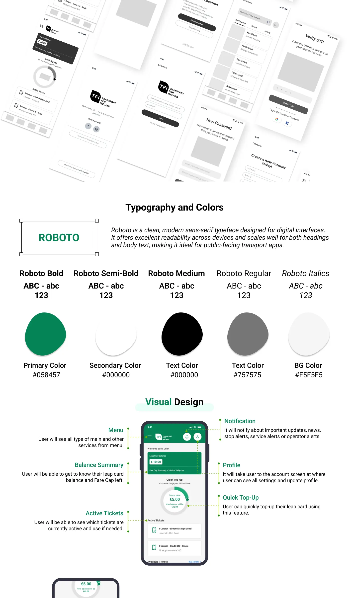
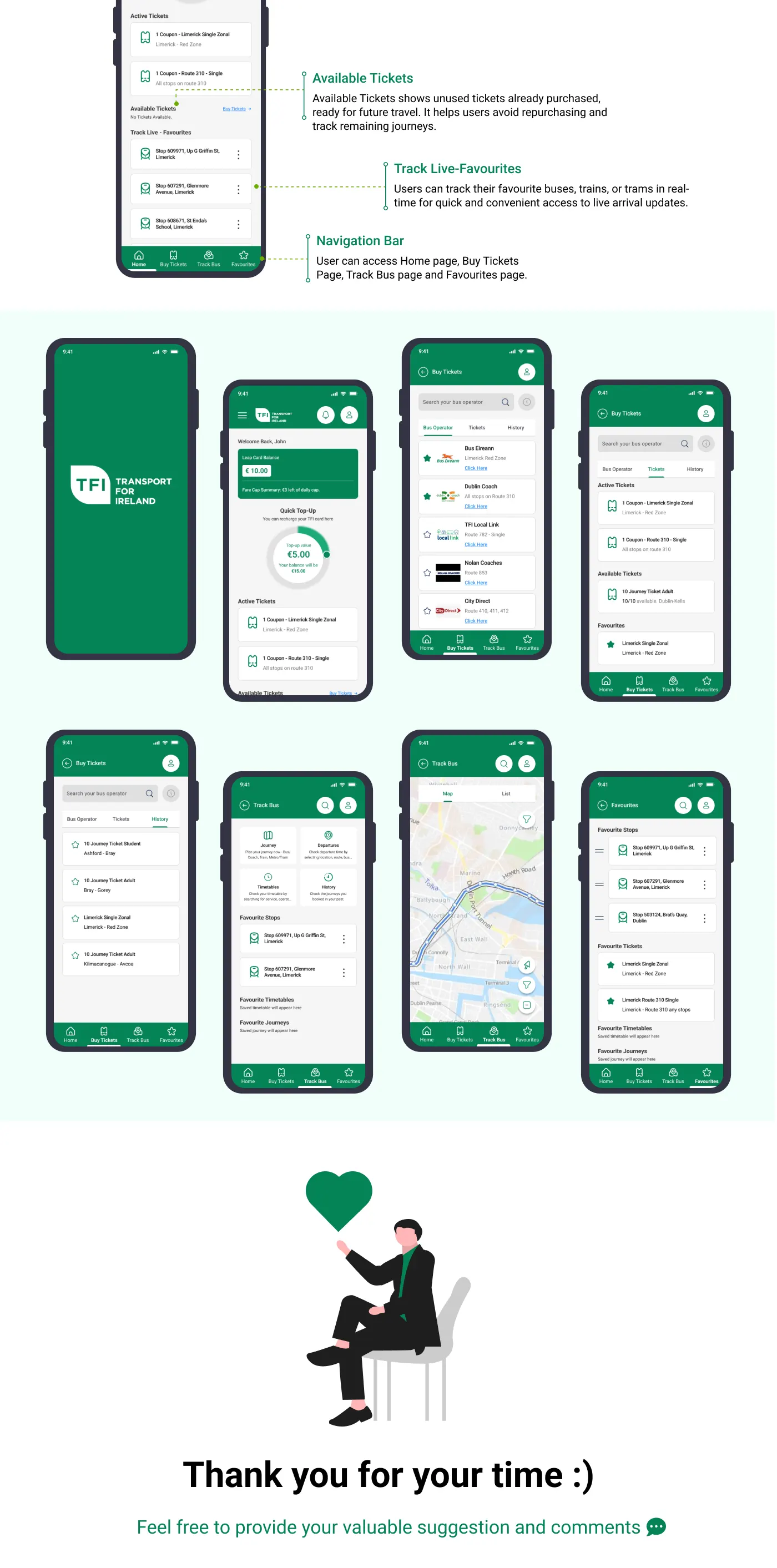
- Balance summary: Leap card balance and fare cap remaining, right on the home screen.
- Quick top-up: recharge a Leap card without leaving the app.
- Active and available tickets: see which tickets are live, and which unused tickets are ready for future trips, so you don’t buy them again.
- Live favourites: real-time arrivals for favourite buses, trains and trams.
- Notifications: service, stop and operator alerts in one place.
- Bottom navigation: Home, Buy Tickets, Track Bus and Favourites.
Visual design
I used Roboto for its readability across devices, with TFI green (#058457) as the primary colour, black and grey (#757575) for text, and a light grey (#F5F5F5) background.
Frame — Boards
Screens & process